

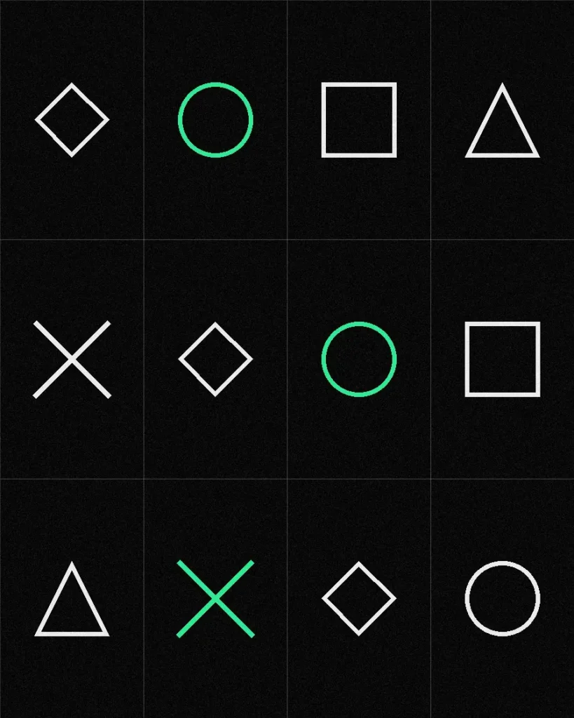
A made-to-measure atelier that had been borrowing a European luxury language it did not need. The mark came out of the pattern-cutting table.
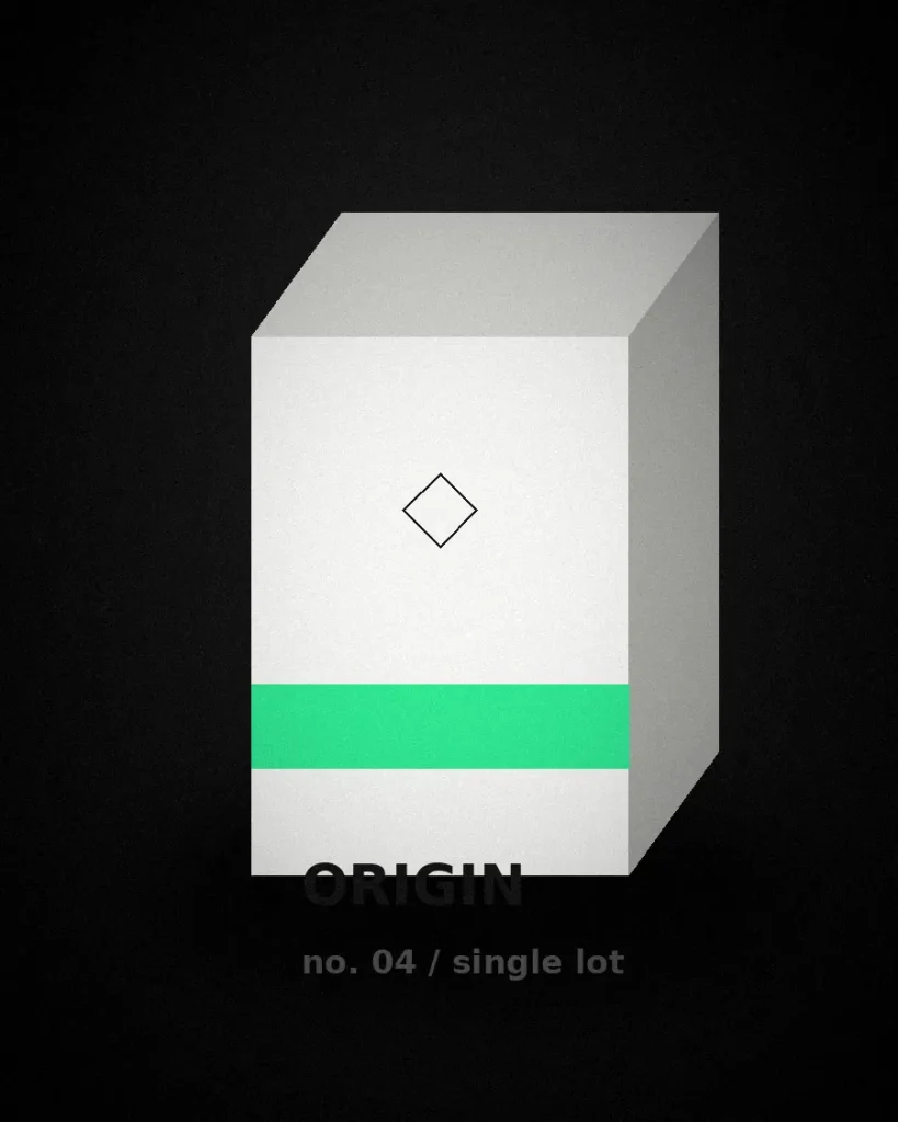
Packaging that has to work on a shelf, in a hand, and at 400 pixels in a subscription email. The lot number does all three.
A restored house in Old Cairo that was being photographed like a business hotel. The identity had to be older than the building's last renovation.
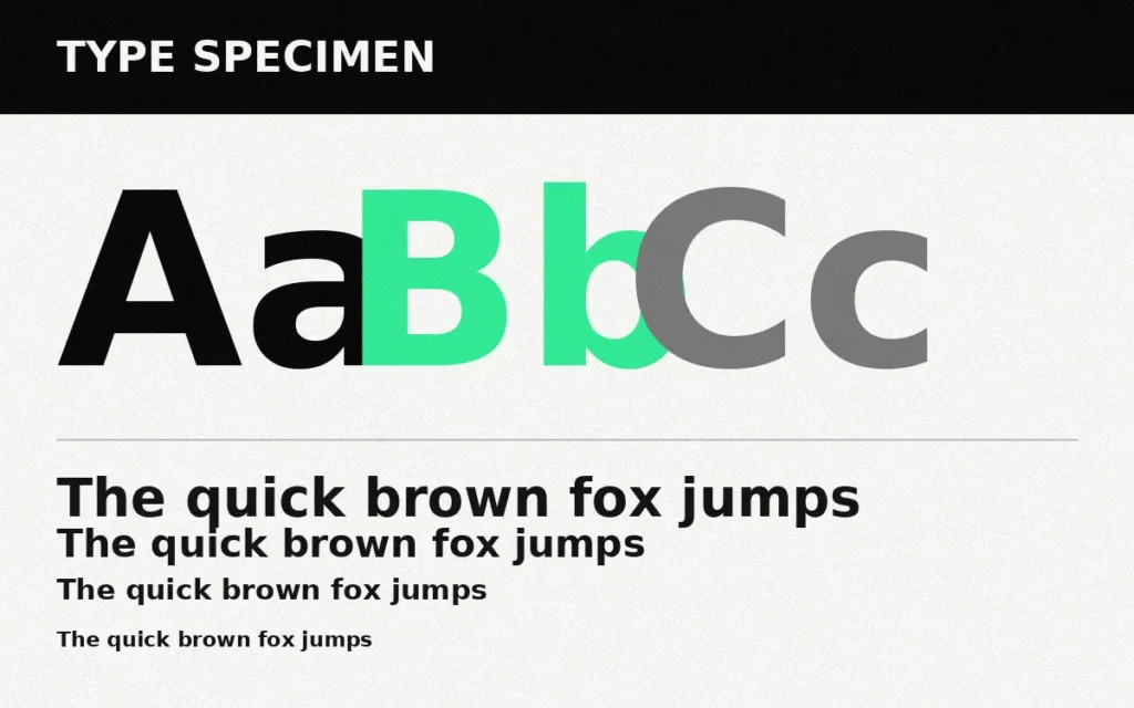
Six years of equity in a mark nobody wanted to lose, and a label system that could not tell two honeys apart. A refresh, not a rebrand.
Eleven pharmacy fascias in two governorates, each painted by a different signwriter. One system that a local contractor can actually execute.
A production house whose credit card was the only place its name appeared at a consistent size. Title cards became the identity.
Five subsidiaries that had drifted into five identities. An endorsement system that lets them keep their own faces and still share a name.
No project matches that combination. The filters above have work behind them, or you can clear them and start again.
Clear filters