Nakhla
Six years of equity in a mark nobody wanted to lose, and a label system that could not tell two honeys apart. A refresh, not a rebrand.
The story
Nakhla’s mark is known among Saudi honey buyers and was not the problem. The labels were: eleven varieties printed from the same template with the name swapped, which is why the store had to explain the price difference in words.
Kept the mark and rebuilt everything around it — the word ‘refresh’ was taken literally, not used as cover for a rebrand.
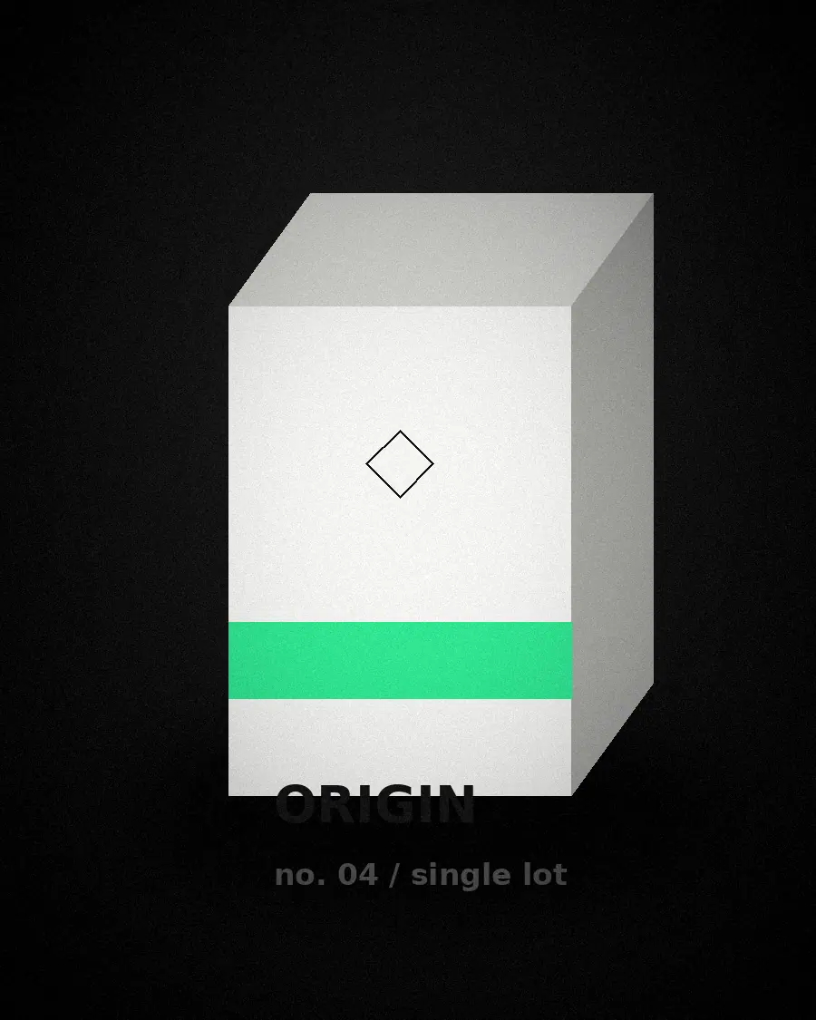
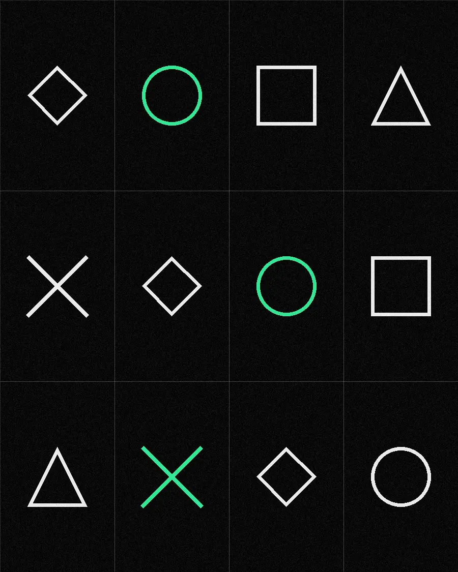
A label system where origin is a colour field and floral source is a drawn icon, so two jars differ before a word is read.
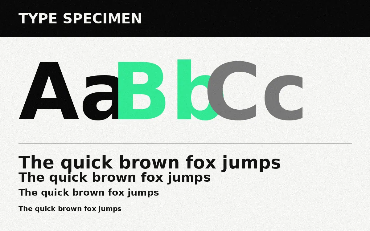
Arabic set in a naskh with proper kashida in the display line, drawn by hand per variety rather than left to the renderer.
Shelf recognition held — the mark did its job — while the varieties finally separated. The store stopped having to argue the price in copy.
Mark refinement
Eleven-variety label system
Origin colour field
Floral source icon set
Campaign toolkit
Updated brand book